

The Power of Print in a Digital World
Design Trends 2025 – In an age dominated by glowing screens, overflowing inboxes, and endless notifications, the digital landscape is suffering from a growing problem: fatigue. Our attention spans are shorter, and the sheer volume of online content makes it harder than ever for a message to truly resonate.
This is precisely why print marketing is not just surviving—it’s having a Renaissance.
With deign trends 2025, print is shedding its reputation as a traditional medium and re-emerging as the powerful, tangible antidote to digital noise. The most successful brands are leveraging its unique ability to engage the senses, create a lasting memory, and forge an authentic, physical connection with their audience.
This article will explore the innovations and creative strategies shaping print this year. We’ll delve into the upcoming design trends, from the imperative of sustainability to the excitement of tactile luxury and the power of hyper-personalization. Get ready to discover how new technologies are helping print seamlessly integrate with digital channels, ensuring your marketing materials don’t just get seen, but get felt, remembered, and acted upon.
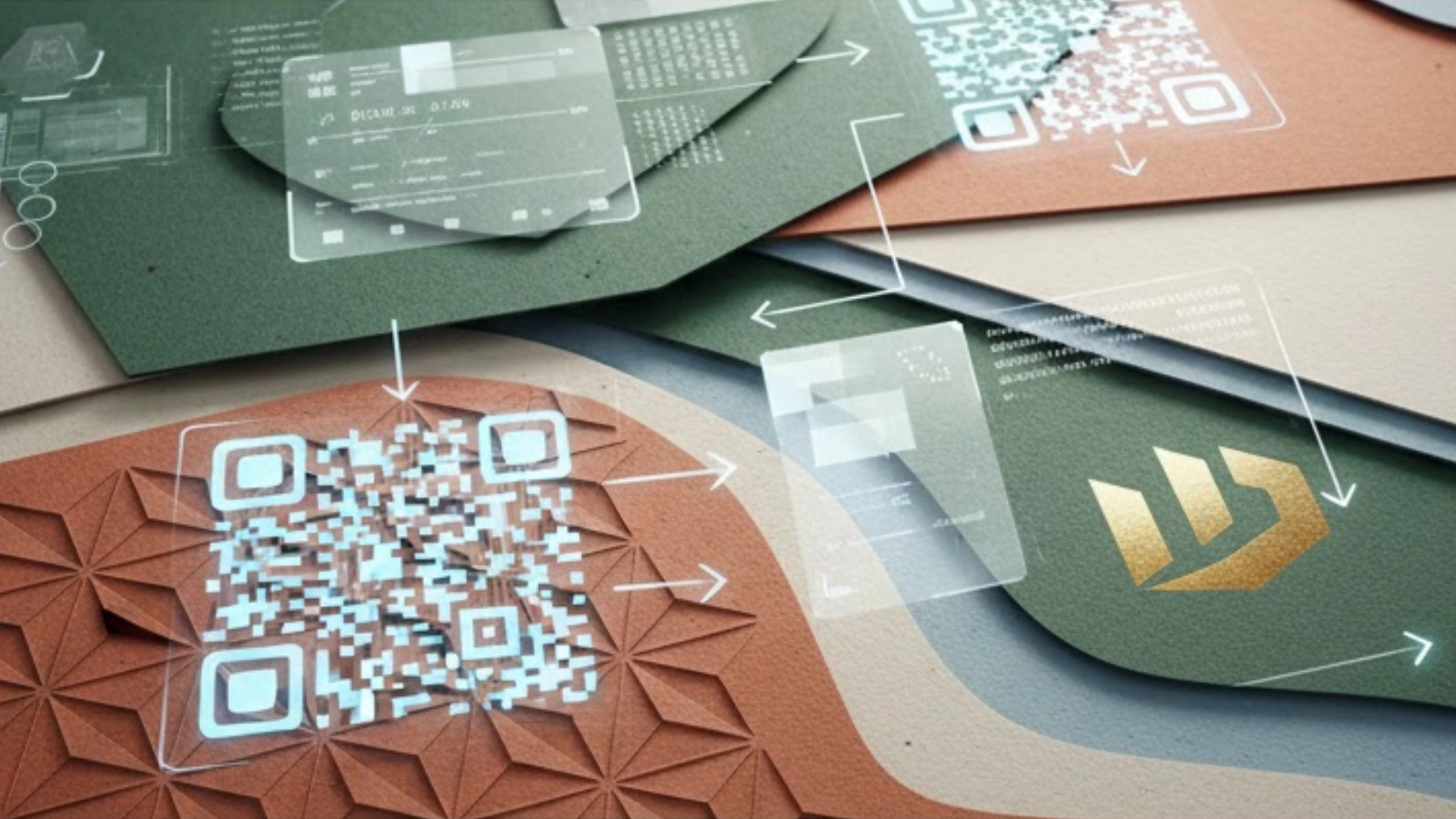
Bridging Worlds: Seamless Print-to-Digital Integration
In 2025, the goal of print marketing isn’t just to be seen; it’s to be the starting point of an action. This trend, Seamless Print-to-Digital Integration, recognizes that today’s consumers exist in both the physical world and the digital world, and they expect brands to connect those experiences effortlessly.
Think of your printed piece—a brochure, postcard, or catalog—not as a dead end, but as a thoughtfully designed bridge leading directly to your online content, special offers, or engaging videos.
Why This Design Trend 2025 is Growing
- Digital Fatigue is Real: While screens overwhelm us, a targeted piece of mail stands out. By adding a digital link, you are giving the reader a specific, easy next step rather than just hoping they remember your website later.
- Measurable ROI: Unlike traditional print that was hard to track, integrating digital elements allows you to use analytics to see exactly how many people scanned your code, what content they viewed, and which print piece drove the best results. This makes your print budget smarter.
- Content Expansion: Print has limited space. Digital integration allows you to use your beautiful print design for high-impact branding and essential information, while letting the digital link carry all the heavy content—like product demos, detailed pricing, or customer testimonials.
How to Use It Effectively
The QR Code Renaissance
The QR code has gone from an awkward novelty to a trusted and universally accepted tool. In 2025, they must be designed as part of the visual aesthetic, not just slapped on as an afterthought.
- Make it Beautiful: Embed the QR code subtly within a custom graphic or a brand pattern. Ensure it’s large enough to be easily scanned, but its colors should complement the overall design.
- Example Idea: On a direct mail postcard printed on recycled, textured paper, integrate a soft-touch coating over the message area and place the QR code on a contrasting metallic foil square to make it pop and guarantee a scan.
- Make the Destination Clear: Always tell the user exactly what they will get by scanning. Instead of just “Scan Here,” use copy like, “Scan to See Our New Product Demo Video” or “Scan for 15% Off Your First Order.”
Augmented Reality (AR) Experiences
AR is where print truly becomes interactive and memorable. It allows a user to point their smartphone camera at your print piece and see a digital element—like a video or a 3D model—pop up and appear anchored to the page.
- For Product Catalogs: Imagine pointing your phone at a static image of furniture and seeing a 3D model appear that you can virtually “place” in your own room.
- For Event Invitations: A formal card, perhaps using an elegant embossing for the main text, can include a trigger that launches a video welcome message from the event host.
- For Packaging: Pointing at a box could launch assembly instructions or a fun, branded mini-game. These experiences are highly shareable and create buzz.
By expertly using design techniques like specialty finishes to draw the eye and integrated technology like QR codes and AR to drive action, your print marketing will not only stand out but will become an indispensable, high-performance part of your overall marketing ecosystem.
The Sensory Imperative: Tactile Luxury and Special Finishes
Description: Moving beyond visual appeal, this section explores the critical role of touch and feel. It will cover how luxurious materials and specialty printing techniques create a premium, memorable brand impression.
In 2025, the most effective print pieces aren’t just something you see; they are something you experience. As our lives become more digital, the sense of touch—the weight of a quality card, the texture of the paper—becomes a powerful, subconscious driver of brand perception and value. This is the essence of Tactile Luxury.
Specialty Coatings and Embellishments
Designers are increasingly using unique finishes to add a layer of sophistication and engagement that digital media simply cannot replicate. These finishes invite the reader to interact with the piece, turning a simple flyer into a treasured item.
- Soft-Touch Coatings: This popular finish creates a velvety, matte texture that instantly communicates a sense of luxury and quality. It makes the printed material feel expensive and invites the recipient to hold it longer.
- Foil Stamping: Gone are the days of basic gold or silver. Modern foil includes holographic, pearlized, and metallic hues that add a flash of high-end glamour. Use it judiciously on a logo or a key headline for maximum impact.
- Embossing and Debossing: This technique raises (embossing) or lowers (debossing) an image or text into the paper, creating a subtle but powerful 3D effect. It is perfect for a brand’s logo or a distinctive pattern, engaging the reader’s sense of touch without relying on color.
The Material Difference
The choice of paper stock is a core design decision. Design Trends 2025, the trend leans toward heavy, thoughtful materials that emphasize quality and substance.
- Premium Weight and Thickness: Using an ultra-thick, layered cardstock for business cards or invitations makes an immediate statement. The weight itself implies permanence and reliability.
- Custom Texture: Materials like linen, cotton, or even wood veneer for specific applications are becoming popular. These custom textures move beyond simple visual design and deepen the brand story.
- Practical Idea: Combine a minimalist design—large, bold typography—on a textured paper. The simplicity of the visual design paired with the richness of the material creates a high-contrast feeling of modern elegance.
- Edge Painting: A subtle but impactful design detail. Adding a bright or metallic color to the edge of a thick business card makes the material pop, catching the eye even when the card is stacked with others.
By engaging the recipient’s hands, you create a deeper connection that enhances memory retention and elevates the perceived value of your brand well beyond what any screen can offer.
Designing with a Conscience: The Green Revolution in Print
Description: Sustainability is no longer a niche trend but a core value. This section will detail how designers and brands are making eco-conscious choices, both in material selection and visual aesthetic.
In 2025, consumers are not just buying a product; they are buying into a brand’s values. Print materials, being physical and tangible, are a direct reflection of a company’s commitment to the environment. Sustainability is no longer optional—it’s a fundamental design and marketing principle that resonates with a global audience.
Eco-Friendly Substrates and Inks
The most impactful change is happening at the production level, where materials are being chosen for minimal environmental impact.
- Recycled and PCW Papers: Businesses are prioritizing paper stocks with high Post-Consumer Waste (PCW) content. Using recycled paper not only saves trees but also significantly reduces the energy and water needed for production.
- Alternative Substrates: Beyond standard paper, designers are experimenting with innovative materials like hemp, cotton, or even stone paper. These choices create a unique tactile feel while communicating a commitment to low-impact sourcing.
- Vegetable-Based Inks: The move away from petroleum-based inks is accelerating. Soy, algae, and vegetable-based inks are biodegradable, easier to remove during the recycling process, and often produce brighter, cleaner colors.
The Natural Aesthetic
Design is being used to visually communicate an environmentally conscious ethos, making the material’s origin part of the brand story.
- Earthy Color Palettes: Muted, nature-inspired colors—deep forest greens, earthy terracotta, and soft blues—are trending. These palettes instantly give materials an organic, honest feel.
- Visible Texture and Speckle: Design is embracing the “imperfections” of recycled paper, where small flecks or visible fibers enhance the authentic, natural look. This honesty in design builds consumer trust.
- Minimalist Layouts (Less is More): Using clean, airy layouts with ample negative space visually conserves resources. It also allows the quality and texture of the eco-friendly paper to take center stage.
By embracing the Green Revolution in print, brands show they are being good stewards of the planet. This intentional choice aligns with consumer values, strengthens brand loyalty, and makes your printed piece a responsible, respected part of the marketing mix.
Hyper-Personalization: Print That Feels Like a Conversation

Description: Detail how advancements in digital printing technology allow for personalized design at scale, enabling one-to-one marketing that significantly boosts engagement and conversion.
In an era of mass advertising, the most valuable message is the one that feels like it was created just for you. Hyper-Personalization in print goes far beyond simply dropping in a name; it involves using data to tailor every visual and textual element of a printed piece to an individual recipient’s preferences, purchasing history, or stage in the customer journey.
Variable Data Printing (VDP) Mastery
VDP is the core technology that makes this trend possible. It allows a printer to swap out text, images, and offers on the fly, within the same print run, without slowing down the press.
- Customized Imagery: A designer can create a direct mail piece that shows a customer the product they recently viewed online but didn’t purchase.
- Targeted Messaging: The language and color scheme can be tailored based on demographic data. For example, a postcard sent to an older, more established neighborhood might use a classic, retro-serif font, while one sent to a younger audience might use a vibrant, maximalist design.
- Unique Offers: Every recipient can receive a unique discount code, offer, or even product recommendation based on their past engagement with the brand. This level of relevance drives much higher conversion rates than generic promotions.
Short-Run and Targeted Campaigns
Personalization is closely linked to the growing preference for smaller, more strategic print jobs, which VDP and modern digital printing technology easily accommodate.
- The End of Bulk Printing: Instead of printing 50,000 generic brochures that may sit in a warehouse, businesses are printing short, frequent runs of a few hundred, specifically tailored to current events, regional audiences, or product launches.
- Flexibility and Agility: Small-batch printing allows businesses to quickly update materials—changing a price, refreshing a design, or A/B testing two different visual approaches—between each print run. This makes print as agile as digital advertising.
- Internal Marketing: VDP is also being used for personalized internal materials, such as welcome kits for new employees or highly customized training manuals, helping to build a strong, personal brand culture.
By making your printed piece a relevant, timely, and personally addressed communication, you cut through the noise and transform a transaction into a true conversation.
2025 Visual Design Aesthetics
Description: A review of the dominating graphic design styles that will shape print layouts, imagery, and typography throughout the year.
While strategy and materiality are key, the visual design is what immediately captures attention. In 2025, the aesthetics are defined by two extremes: bold simplicity and rich complexity, with typography often acting as the star of the show.
Bold Minimalism with Accents
Minimalism remains a strong influence, but it’s evolving past pure simplicity. This trend uses an intentionally stripped-back canvas to make a single element shout.
- The Power of Contrast: Designs feature vast white space and clean layouts, but they are punctuated by a single bold color, a high-contrast image, or a tactile finish like enhanced foil to create a moment of visual drama.
- Fewer Elements, Greater Impact: By focusing the reader’s eye on just one or two powerful components—a monumental headline or a single, exquisite illustration—the message becomes instantly clear and sophisticated.
Retro-Futurism and Nostalgia
This aesthetic blends the warm familiarity of the past with the clean, often vibrant, energy of the future. It’s a design style that feels both familiar and forward-looking.
- Color and Gradients: Look for color palettes that reference the late 80s and early 90s, featuring muted pastels and rich, sometimes slightly “off” colors. This is often paired with modern, vivid gradients that add a sense of digital depth.
- Mixing Eras: Combine retro serif typography and analog-style images with futuristic, clean vector graphics or metallic color effects. This juxtaposition creates a visually intriguing tension.
The Rise of Custom Typography
In 2025, typography is taking center stage, moving beyond supporting text to becoming the main piece of art in the design.
- Oversized and Expressive: Fonts are getting bigger and bolder. Designers are using custom or experimental typefaces that reflect the unique personality of the brand.
- Typographic Illustration: Instead of relying on photography, entire pages may be composed using abstract geometric shapes and custom type that forms its own illustration. This is highly effective for direct mail and small-format pieces where quick readability is essential.
By staying on top of these aesthetic shifts, you ensure your print materials feel current, relevant, and powerful enough to cut through the noise of a crowded media landscape.
Conclusion: Your 2025 Print Strategy
In an environment of digital saturation, 2025 is the year print truly comes into its own as a premium, powerful, and essential marketing channel. The most successful print campaigns will be those that embrace a multi-faceted approach, prioritizing:
- Tactile Engagement: Creating pieces that feel luxurious and memorable through specialty finishes like embossing and soft-touch coating.
- Sustainability: Aligning with customer values through the responsible use of recycled paper and eco-friendly inks.
- Seamless Integration: Using tools like QR codes and AR to link the physical piece to a dynamic, measurable, digital experience.
These trends are more than just fleeting fads; they represent a fundamental shift in how we value physical communication.
Are you ready to transform your brand’s print strategy from a routine expense into a high-impact, measurable investment?
Reach out to David Arthur Design today to discuss how we can leverage the top design trends of 2025 to create a campaign that not only looks incredible but delivers measurable results.
Contact me today
What are the three main design trends shaping print marketing in 2025?
The three major trends are:
Seamless Print-to-Digital Integration: Using print as a starting point of an action to drive users to online content.
Tactile Luxury and Special Finishes: Moving beyond visual appeal to engage the sense of touch.
Sustainability (The Green Revolution in Print): Prioritizing eco-conscious materials and processes.
How is the QR code being revitalized in 2025 print marketing?
The QR code is undergoing a “Renaissance” by becoming a designed element, not just an afterthought. Key methods for effective use include:
Clear Destination: Always telling the user exactly what they will get by scanning (e.g., “Scan to See Our New Product Demo Video”).
Aesthetic Integration: Subtly embedding the code within a custom graphic or brand pattern.
What does the article mean by “Tactile Luxury,” and what are some examples of specialty finishes?
Tactile Luxury is the idea that the most effective print pieces are experienced through the sense of touch, creating a powerful, subconscious driver of brand perception. Examples of specialty finishes include:
Embossing and Debossing: Raising or lowering an image or text to create a subtle 3D effect.
Soft-Touch Coatings: Creates a velvety, matte texture.
Foil Stamping: Using metallic, holographic, or pearlized foils for high-end glamour.
What role does Augmented Reality (AR) play in the Print-to-Digital Integration trend?
AR allows a user to point their smartphone at a print piece and see a digital element—like a video or a 3D model—pop up and appear anchored to the page. This makes print truly interactive and memorable for applications like:
Event invitations (launching a video welcome message).
Product catalogs (seeing a 3D model of furniture).
What is “Hyper-Personalization,” and what is the technology that makes it possible?
Hyper-Personalization goes beyond simple name insertion to tailor every visual and textual element of a print piece based on an individual’s data (like purchasing history). The core technology that enables this design at scale is Variable Data Printing (VDP).


