

Why Perfect Print Files Matter
You’ve poured your heart and talent into a stunning design—the colors are perfect, the typography sings, and the layout is flawless. But when it comes to sending that file to a professional printer, achieving perfect print files is the critical step that determines whether you get a beautiful finished product or a costly, frustrating disaster.
We often hear from clients who have been burned by unexpected reprints, project delays, or, worst of all, final products that simply don’t match the screen-ready proof. The single biggest culprit? A technically flawed print file.
The Cost of “Close Enough”
In the world of commercial printing, “close enough” means re-runs, and re-runs mean money, time, and stress. A simple mistake—like forgetting to add bleed or leaving an image at low resolution—can stop a press run dead in its tracks. For a small business owner, that means missing a crucial marketing deadline; for a marketing professional, it means blowing a budget.
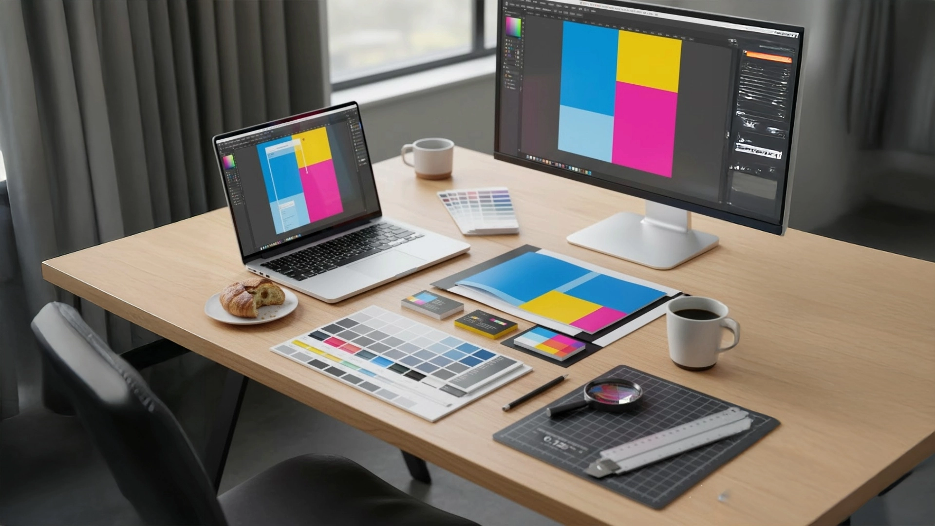
Your Print Broker’s Secret Weapon
As your freelance designer and print broker, my goal is to make the entire process seamless. But even the best broker needs the right input. This guide pulls back the curtain on the most common, costly mistakes we see every day, focusing on four pillars of perfect print files: Bleed, Resolution, Color Mode, and File Setup.
By understanding these simple technical concepts, you not only save time and money but also guarantee that your vibrant vision translates flawlessly from screen to paper.
The Bleed Blunder: Don’t Get Caught on the Edge

This section explains the concept of ‘bleed,’ why it’s absolutely necessary for professional trimming, and the critical difference between the bleed area, the final trim size, and the safety margin.
Imagine you’ve designed a gorgeous postcard with a vibrant photo that runs right to the edge. You send the file off, excited, only to get the finished piece back with thin, uneven white lines framing your image. What happened? You fell victim to the Bleed Blunder.
No matter how sophisticated the equipment is, commercial printing requires the printed sheet to be cut (or “trimmed”) to its final size. The cutting machines are incredibly precise, but they are not perfect—a tiny shift of a millimeter is normal and expected.
What is Bleed, and Why is it Necessary?
Bleed is simply extra image area that extends beyond the final edge of your printed piece.
Think of it as an insurance policy. By extending your background colors and images past the final cut line, you ensure that when the guillotine blade comes down, it cuts through the ink and not through the white paper. This eliminates those unsightly white slivers, guaranteeing your design looks edge-to-edge perfect.
Setting it Up Right
The standard bleed size for most commercial print jobs is 0.125 inches (or 1/8 inch), which is approximately 3 millimeters (3mm).
When you set up your file, you are defining three key areas:
- The Bleed Line (Outer Edge): This is the very edge of your document, including all the extra image or background area. All background colors and images must extend to this line.
- The Trim Line (Final Size): This is the line where the product will actually be cut. If you ordered a $4” \times 6”$ postcard, this line marks the 4” \times 6” dimensions.
- The Safety Margin (Inner Area): This is an imaginary boundary inside the trim line, usually also set at $0.125”$.
The Safety Net (The Golden Rule of 0.125”)
While your background extends out to the bleed line, all your important elements—your client’s logo, phone number, headline text, etc.—must stay in the safety margin.
The Golden Rule: Keep all critical text and images at least 0.125” inside the final trim line.
If you place important content too close to the edge, a minor shift during trimming could accidentally slice off part of a phone number or a letter, ruining the piece. By respecting the safety margin, your key information is protected and perfectly centered.
Resolution Reality Check: Sharpness vs. Blur

This section provides a non-technical explanation of DPI/PPI, establishes the essential $300$ DPI standard for commercial printing, and warns against the financial and aesthetic dangers of using low-resolution, web-quality images.
If the Bleed Blunder results in white edges, the Resolution Reality Check results in blurriness. Your gorgeous, high-impact photo or logo that looked crisp on your computer screen might turn into a pixelated, fuzzy mess on paper. This is a matter of resolution.
Pixels vs. Print Quality: Understanding DPI
Resolution is measured in DPI (Dots Per Inch) for printing, or PPI (Pixels Per Inch) for digital screens. In simple terms, this measurement tells the printer how many tiny dots of ink it needs to place within every single inch of your design.
- Low DPI (e.g., 72 DPI): Used for screens, web graphics, and emails. They load fast but have very few dots of information per inch. When stretched on paper, these dots become visible “squares” (pixels), resulting in a blurred or “jagged” look.
- High DPI (e.g., 300 DPI): Used for professional printing. This higher density of dots allows for smooth lines, sharp detail, and crisp transitions between colors.
The Golden Rule: 300 DPI
For any item that will be viewed up close—like brochures, business cards, flyers, and postcards—the single most important number to remember is 300 DPI.
300 DPI is the minimum standard for commercial, offset, and digital printing to achieve a true, high-quality, photographic result. If your image is below this number, we can almost guarantee a loss of quality on the final printed piece.
The Upscaling Trap: Don’t Stretch It!
Clients often try to fix a low-resolution image by simply increasing the DPI setting in their design software. This does not work.
- If an original image is 72 DPI, it only has a limited amount of pixel data.
- Telling the software to make it 300 DPI forces the program to guess at the missing detail, which simply stretches the existing, limited information.
The only way to achieve true 300 DPI is to start with a high-resolution source image (such as a professional photo or a vector logo file) that has enough original data for the print size you need.
The Color Conundrum: Understanding CMYK vs. RGB

This section will demystify color spaces, focusing on the fundamental difference between light-based screen colors (RGB) and ink-based print colors (CMYK) and why files must be set up correctly.
This is perhaps the most frequent source of disappointment for clients: the color on the printed piece doesn’t match the vibrant design they saw on their monitor. The root cause is a misunderstanding of how color works on screen versus how it works on paper.
Screen vs. Ink: Additive vs. Subtractive Color
There are two primary color models, and they behave very differently:
| Color Model | Used For | How It Works | The Problem |
| RGB (Red, Green, Blue) | Digital Screens (Websites, TVs, Phones) | Additive Color—It uses light. When you mix all three colors together, you get white light. It creates the largest, most vibrant range of colors. | RGB colors are impossible to reproduce using physical ink; they are too bright and luminous. |
| CMYK (Cyan, Magenta, Yellow, Key [Black]) | Commercial Printing | Subtractive Color—It uses ink pigments. When you mix all four inks together, you get black. It produces a more limited, muted range of colors. | If a print file is left in RGB, the printer’s software is forced to “guess” the CMYK equivalent, resulting in an unexpected color shift. |
The Color Shift
When your design is sent to print, it must be converted from the light-based RGB model to the ink-based CMYK model. If you, the designer, don’t perform this conversion properly (ideally, by setting up your document in CMYK from the start), the printer’s software will do it for you. This automatic conversion is often less than ideal and can cause your bright blues to become dull, or your neon greens to look flat.
Setting Your Document Correctly
To minimize the color shift and ensure predictability:
- Start in CMYK: Always create new print documents in your design software using the CMYK color profile. This forces you to design within the printable color range.
- Convert Layered Files: If you are using images or graphics originally sourced in RGB, convert them to CMYK before placing them into your final print file.
Spot Color (Pantone): Consistency is King
For clients with strict brand guidelines, especially those with specific logo colors (like the exact shade of Coca-Cola red or Tiffany blue), you’ll need to use Spot Colors (often referred to by their brand name, Pantone).
A Pantone color is a pre-mixed, solid ink that uses a universal numbering system. It guarantees that the color looks identical no matter where or when it’s printed—it bypasses the minor variations that can happen when CMYK inks are combined.
Font Fails and Missing Links: Preparing the Final File
Practical steps for packaging your design, including outlining fonts and ensuring all images are properly linked. This section concludes with why the print-ready PDF is the universally preferred final file format.
You’ve successfully managed bleed, checked your resolution, and converted your colors to CMYK. Now, the final step is packaging the design so the printer sees exactly what you see. A few simple oversights at this stage can still sabotage the entire project.
The Font Fails: Why Your Type Might Change
If a design file (like an Adobe InDesign or Illustrator document) is sent to a printer who doesn’t have the exact font you used installed on their computer, the software will automatically substitute it with a default font (like Times New Roman). This is called a font fail, and it completely ruins your carefully chosen typography and layout.
The Fix: Outlining Fonts
To prevent this, you must “outline” or “convert to paths” all of your final text. This process turns the text characters from editable font data into uneditable vector shapes. The printer no longer needs the font file; they just need to print the shape.
Note: Only outline your text in a copy of your final design file. Once text is outlined, it cannot be edited or spell-checked.
Missing Links: The Empty Box Problem
When you design, your software usually doesn’t embed large images (like high-resolution photos) directly into the file. Instead, it “links” to the external image file on your hard drive. If you send the design file without including those separate, linked image files, the printer sees only empty boxes or low-resolution previews.
The Fix: Embed or Package
- Embed: For small projects or simple logos, you can often embed the images directly into the final design file (e.g., in a PDF).
- Package: For larger projects (like brochures or books), always use your design software’s “Package” or “Collect for Output” function. This automatically gathers your main design file, all linked images, and the necessary font files into one neat folder.
The Preferred Format: Print-Ready PDF/X
While packaging folders are helpful, the universal standard for commercial printing is a High-Quality Print-Ready PDF.
A well-exported PDF “flattens” the file, locking in the bleed, resolution, and CMYK color settings, and it automatically handles the font and image linking issues. When exporting from professional software, look for the PDF/X-1a preset, as this option is specifically designed to meet rigorous print industry standards.
Conclusion: Partnering for Print Perfection
A final summary emphasizing that collaboration with a professional designer and print broker is the easiest, most reliable way to guarantee success and eliminate printing stress.
The journey from a great design concept on your screen to a stunning, finished piece in your hands requires navigating a few essential technical details. While this guide has armed you with the critical knowledge, the truth is that preparing a file perfectly—every single time—is a specialized skill that takes focus and practice.
Your Perfect Print File Checklist Recap
To ensure your next project is flawless, keep these four technical pillars in mind:
- The Bleed Blunder: Always extend background elements at least 0.125” past the trim line and keep important text 0.125” inside the trim line (the safety margin).
- Resolution Reality Check: Never use web images; all close-up print photos and graphics must be sourced or created at 300 DPI or higher.
- The Color Conundrum: Design your file using the CMYK color profile to minimize unpredictable color shifts when printing.
- Font Fails & File Setup: Outline all text and export your final design as a high-quality PDF/X-1a to ensure fonts and links are locked in.
The Value of Expertise
The best way to guarantee that your investment in design translates into a perfect printed product is to partner with a professional designer and print broker.
When you work with us, you are not just getting a design; you’re getting an expert who handles every technical file check, manages the print vendor relationship, and provides the final quality control. We manage the complexity of the press run so you can focus on running your business and enjoying the results.
Ready to see your next marketing piece shine with professional perfection? Contact me today!
What is “bleed” and why is it mandatory for professional printing?
Bleed is extra image or color area that extends past the final trim edge of your design. It is mandatory because it gives the cutting machines a small margin for error, preventing thin, uneven white lines from appearing on the final product.
Why do colors look different when printed compared to what I see on my screen?
Screens use the light-based RGB (Red, Green, Blue) color model, which is very bright. Printers use the ink-based CMYK (Cyan, Magenta, Yellow, Black) color model, which has a more limited range. You must convert your file to CMYK before printing to minimize this inevitable “color shift.”
What is the minimum resolution (DPI) required for high-quality print files?
The standard minimum resolution for any close-up print item (like a business card or brochure) is 300 DPI (Dots Per Inch). Anything lower, like the 72 DPI used for web graphics, will result in a blurry or pixelated final print.
Why can’t I just use the font file I have? What does “outlining fonts” mean?
If the printer doesn’t have the exact font you used, their software will substitute it, ruining your layout. “Outlining fonts” converts the editable text into uneditable vector shapes, eliminating the need for the font file and ensuring the typography prints exactly as designed.
What is the best type of file to send to a commercial printer?
The universally preferred format is a high-quality Print-Ready PDF, specifically using the PDF/X-1a preset. This format “flattens” the file, locking in the bleed, resolution, and color settings to prevent last-minute errors.


